Examples
Real-world examples and patterns for using react-native-kline-chart.
Basic Chart
Minimal setup with required props only.
BasicChart.tsx
import { KlineChart } from 'react-native-kline-chart';
import { GestureHandlerRootView } from 'react-native-gesture-handler';

function BasicChart({ data, width }) {
  return (
    <GestureHandlerRootView style={{ flex: 1 }}>
      <KlineChart data={data} width={width} height={400} />
    </GestureHandlerRootView>
  );
}
Full Featured
Chart with all features enabled — MA lines, crosshair, and custom colors.
FullFeaturedChart.tsx
import React, { useState, useCallback } from 'react';
import { View, Text, useWindowDimensions, StyleSheet } from 'react-native';
import { GestureHandlerRootView } from 'react-native-gesture-handler';
import { KlineChart } from 'react-native-kline-chart';
import type { Candle } from 'react-native-kline-chart';

export default function FullFeaturedChart({ data }: { data: Candle[] }) {
  const { width } = useWindowDimensions();
  const [active, setActive] = useState<Candle | null>(null);

  const onCrosshair = useCallback((c: Candle | null) => setActive(c), []);

  return (
    <GestureHandlerRootView style={styles.root}>
      {active && (
        <View style={styles.infoBar}>
          <Text style={styles.pair}>BTC/USDT</Text>
          <Text style={styles.ohlc}>
            O:{active.open} H:{active.high} L:{active.low} C:{active.close}
          </Text>
        </View>
      )}
      <KlineChart
        data={data}
        width={width}
        height={500}
        showMA
        maPeriods={[5, 10, 20]}
        maColors={['#F7931A', '#5B8DEF', '#C084FC']}
        showCrosshair
        onCrosshairChange={onCrosshair}
        candleWidth={8}
        candleSpacing={3}
        bullishColor="#2DC08E"
        bearishColor="#F6465D"
        backgroundColor="#0B0E11"
        gridColor="rgba(255,255,255,0.06)"
        textColor="rgba(255,255,255,0.35)"
      />
    </GestureHandlerRootView>
  );
}

const styles = StyleSheet.create({
  root: { flex: 1, backgroundColor: '#0B0E11' },
  infoBar: { padding: 16, gap: 4 },
  pair: { color: '#fff', fontSize: 18, fontWeight: '700' },
  ohlc: { color: 'rgba(255,255,255,0.6)', fontSize: 12, fontFamily: 'monospace' },
});
Custom Dark Theme
A fully customized dark theme matching your app's design system.
DarkTheme.tsx
<KlineChart
data={data}
width={width}
height={500}
backgroundColor="#0f0f1a"
bullishColor="#4ade80"
bearishColor="#f87171"
gridColor="rgba(148, 163, 184, 0.06)"
textColor="rgba(148, 163, 184, 0.4)"
crosshairColor="rgba(148, 163, 184, 0.3)"
showMA
maPeriods={[7, 25, 99]}
maColors={['#fbbf24', '#60a5fa', '#a78bfa']}
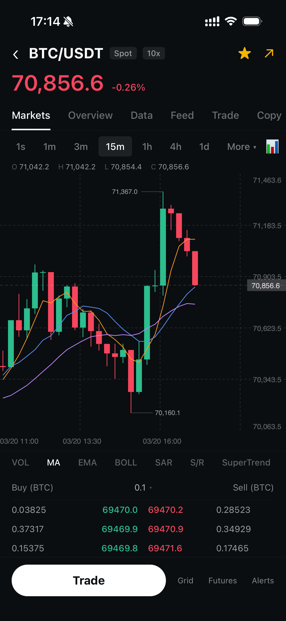
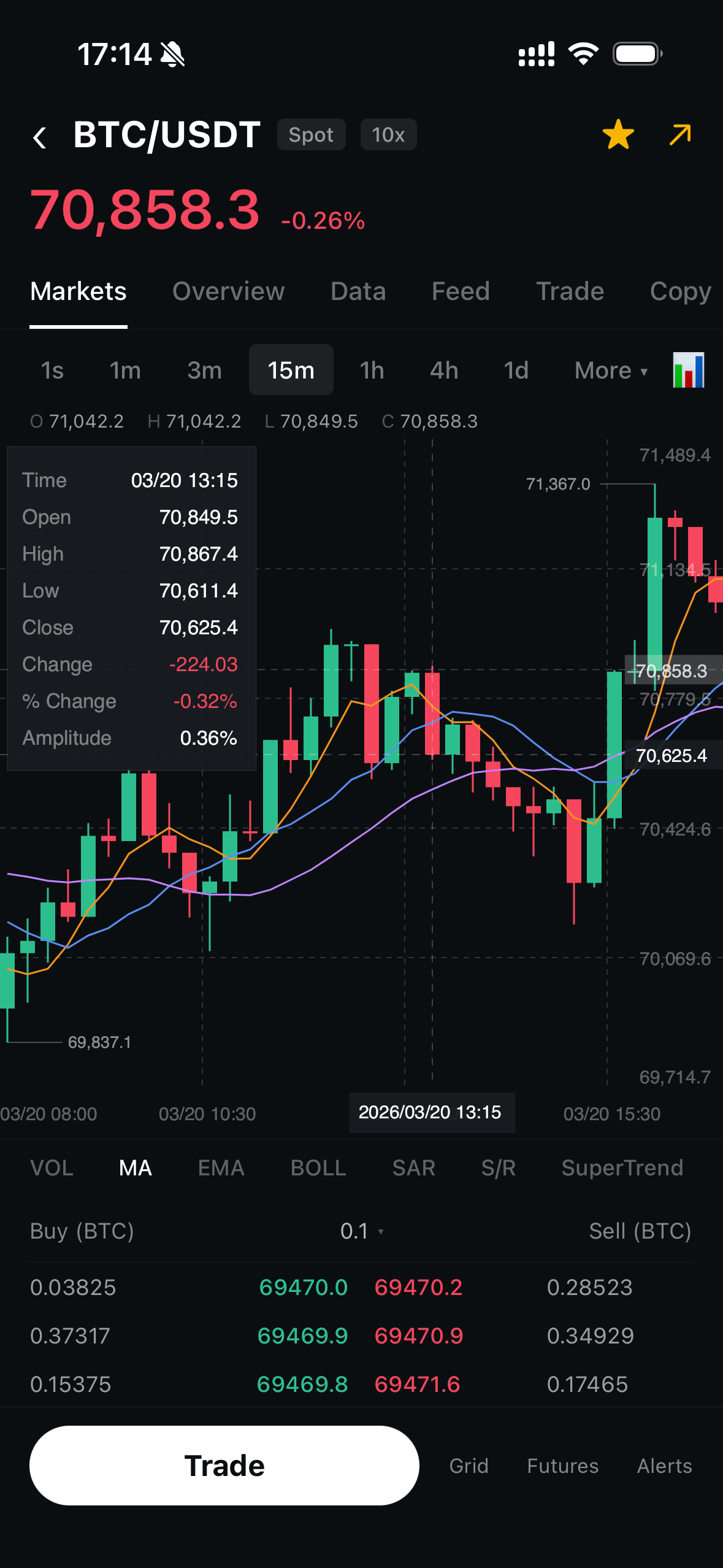
/>Screenshots
See the chart in action: